Choose Photo-Album Paper With a Useful Print Comparison
Choose album paper by comparing the same representative pictures on the actual available materials, at useful size and under the light in which the book will be read. Finish names alone cannot establish color, shadow detail, handling feel or how a page behaves in a particular binding.
A glossy landscape that looks striking on a sample card may be inconvenient in a book read under a ceiling light. A textured matte stock may suit one photograph but compete with another's fine detail. The useful question is not which surface is universally best, but which combination works for this image set, page design and reader.
Find out what the proposed page really is
Ask whether the supplier is offering a photographic print, an inkjet-printed sheet or another printing process, and whether the finished page is a single sheet or a mounted construction. Paper weight, thickness and page rigidity are different properties. A heavier sheet does not tell you how a finished spread will turn or how bulky the whole album will become.
Request an identified sample for each option. Record the exact range, finish and printing workflow so that “the matte one” can be traced later. A blank swatch can reveal surface and base color; an image-bearing sample is needed to inspect reproduction. A finished sample book answers handling questions that a loose sheet cannot.
| Sample | Useful evidence | What it does not establish |
|---|---|---|
| Blank stock | Base tone, texture and sheet feel | How the chosen images reproduce |
| Printed test sheet | Color relationships, detail and reflection | Page turning in the finished binding |
| Sample book | Page construction and viewing at the centre | Exact appearance of your files unless they were used |
| Supplier specification | Named material and stated process | Your personal preference when viewing the result |
Compare surfaces without turning names into promises
Manufacturers such as Canson distinguish matte, satin and glossy-related surfaces by their viewing and rendering characteristics. Their range descriptions are useful starting points, but do not make all products with the same finish name interchangeable. Evaluate the offered item in its production workflow rather than assigning every matte paper one fixed behavior.
Tilt the sample through the angles at which a reader would hold a book. Note where a reflected light interrupts a face or dark area. Then examine it in diffuse light. A surface that is comfortable in one position may show a distracting reflection in another; the practical comparison should include both.
Do not infer lifetime from finish alone. A claim about permanence needs a stated combination of paper, image-forming materials, test conditions and storage assumptions. A reassuring adjective on a sample label is not a date until which every family album is guaranteed to remain unchanged.
Make a test sheet that can expose a problem
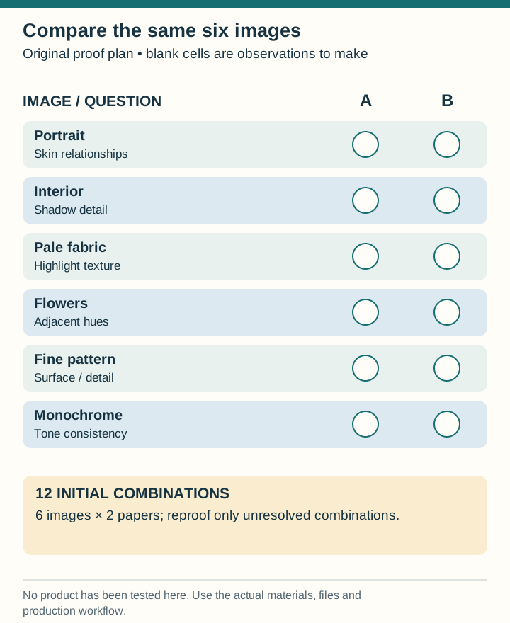
Select six images from the actual project: a face, a dark interior, a pale dress or cloud, a saturated subject, fine texture and a monochrome image. Print the same prepared versions on both candidates. Avoid improving one file between samples, because the comparison would then combine a paper change with an editing change.
Use a useful image size. Tiny thumbnails can hide the texture and shadow problems that matter on a full page. If a detail is important, include both its intended placement and a larger inspection crop clearly labelled as such. Keep identifiers visible so every observation refers to the right version.
| Image ID and subject | Question to answer | Record a specific observation |
|---|---|---|
| 01 · Portrait | Do skin and surrounding colors relate naturally? | Name the affected area, not simply “warm” or “wrong” |
| 02 · Interior | Can the important shadow detail be read? | Identify a chair, fold or object that disappears |
| 03 · Pale fabric | Does meaningful highlight texture remain? | Note where separate folds merge |
| 04 · Bright flowers | Is the desired color relationship maintained? | Compare adjacent hues, not brightness alone |
| 05 · Fine pattern | Does surface texture compete with detail? | Inspect the intended reading distance |
| 06 · Monochrome | Is the chosen tone consistent across the image? | Describe any unwanted cast in the actual sample |
Work through a decision without inventing a quality score
Suppose candidate A shows the dark interior clearly but produces a strong reflection over the central portrait under the intended reading lamp. Candidate B is easier to view at that angle, yet the interior's darkest furniture merges. These are fictional observations, not tests of named products.
The next decision is not automatically “A wins” or “B wins.” Ask whether a revised output version on B can separate the important furniture without damaging the rest of the image. Obtain a new proof if that photograph is central to the book. If it is a minor image, a different selection may solve the problem more honestly than forcing one surface to suit every file.
Six images on two papers create 12 image–paper combinations. A second round for two troublesome images adds four combinations. This modest plan produces 16 comparisons focused on actual uncertainties; printing dozens of unrelated attractive examples would not necessarily answer the decision better.
Keep the color workflow consistent
Ask the receiving service which file format and embedded color profile it requires. Do not convert to an arbitrary profile simply because a different printer once requested it. If the supplier offers soft-proofing instructions, use the profile and settings for the actual output process and retain an unchanged source version.
A screen preview and a physical print are different viewing situations. Use the screen to prepare and inspect files, then judge a relevant physical proof for the paper decision. If the samples were made by a process different from the final album, record that limitation before treating the result as approval.
Approve the combination you compared
- Material: exact stock and finish identifier.
- Process: the supplier's confirmed printing route.
- Files: version of the test images and any approved correction.
- Construction: relevant sample book or page specification.
- Exceptions: any image still awaiting a new proof.
Use the phone-photo preparation guide before testing files from mixed sharing routes. The scanning guide addresses inherited prints whose limitations originate in capture. After choosing the page, the album storage guide explains how location and handling remain part of its care. Paper choice is an informed production decision, not a substitute for either good source files or sensible storage.