Album-cover swatches: compare colour, texture and the full design
An album-cover swatch should help you approve a specific material in a specific combination. Keep its label, compare it beside the photographs and decoration, and confirm what the supplier will actually use. A colour name such as “ivory” or “navy” is not a complete material specification.
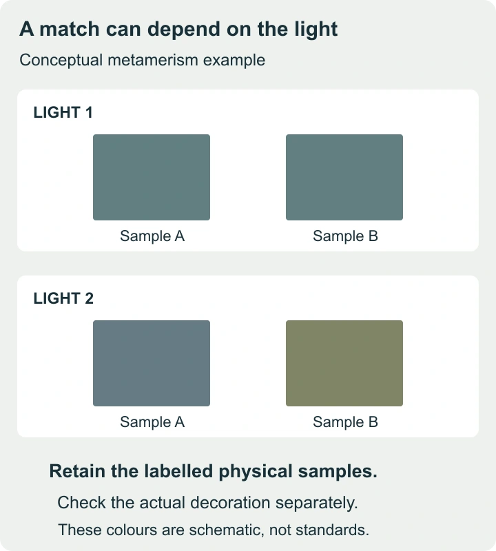
This guide separates appearance, production suitability and photograph-contact requirements. A sample can answer some questions directly, while others need documentation or a finished proof. No historical Cypress swatch codes or present-day stock options are inferred from this older page address.
Find out what the sample represents
Before choosing between colours, establish the supplier, range, material code, finish and date supplied. Ask whether the sample represents current production and whether the finished cover will use the same material and orientation. An unlabeled scrap is difficult to reorder and weak evidence of an exact match.
If you are matching an existing album, keep the old object and the new sample distinct in the record. The existing cover may have changed through use or light exposure. A visually similar new material is not necessarily the same historical fabric, dye or finish.
| Field | What to record | Why it matters |
|---|---|---|
| Identity | Supplier, range and exact sample code. | Prevents “the blue one” becoming an ambiguous instruction. |
| Representation | Finish, orientation and any stated batch relationship. | Clarifies what the swatch does and does not promise. |
| Use | Front cover, spine, box, lining or another component. | A material suitable for one location may need different evaluation elsewhere. |
| Decoration | Approved title, method, size, colour and position. | Connects the material choice to the actual cover design. |
| Approval | Date, approved combination and retained sample. | Creates a reference for substitutions or production queries. |
Compare under the same light, then another relevant light
Place candidate swatches together on a neutral surface, beside the same reference photograph. View them under the main lighting where the album will usually be seen. Then check a second plausible setting, such as ordinary daylight. Keep the comparison conditions consistent rather than moving one candidate into brighter light.
Colour-measurement specialists describe metamerism as two samples matching under one light but differing under another. That is a particular relationship between materials and illumination, not a synonym for every change in appearance. A difference caused by shadow, viewing angle or gloss should be recorded as such.
A phone photograph is useful for remembering the arrangement, but it is not an exact colour standard. Camera processing and the display used to view it intervene between the material and the viewer. If a close match matters, retain the physical samples and agree on the comparison conditions with the supplier.
Do not judge a swatch only under a bright desk lamp if the album will usually sit in a softly lit room. The relevant question is whether the combination works in its likely use, not whether a colour can look appealing under one carefully chosen light.
Inspect texture and direction at a useful scale
Look at the swatch straight on and from an angle. Rotate it while keeping the light fixed. A weave, pile or glossy surface may look different with direction; note the orientation that you approve. Ask whether the material will run the same way across the cover and spine.
Use a larger sample or a finished example when the small swatch does not show the effect. A texture that seems delicate on a tiny square may become visually prominent over a whole cover. That is especially relevant when the photographs are quiet, low-contrast images and the cover risks dominating the presentation.
For a book intended to be handled frequently, ask about the manufacturer’s care instructions and any performance evidence that matters to you. Touching a sample can reveal immediate feel; it does not establish years of abrasion resistance, cleaning tolerance or colour stability. Do not perform an improvised destructive test on the only approval sample.
Choose the combination, not three isolated favourites
Assemble the cover swatch, ribbon or other trim, endpaper candidate and a representative photograph. If a presentation box is part of the project, add its material too. A favourite colour can become less convincing beside another component, and a subtle title can disappear against a textured surface.
| Candidate | Visual relationship | Unresolved issue | Next action |
|---|---|---|---|
| A — warm neutral | Works with warm-toned photographs in the trial arrangement. | The pale title is difficult to distinguish. | Request a darker title proof on the same material. |
| B — cool grey | Looks restrained beside black-and-white prints. | Its relationship to the box changes under the second light. | Compare both materials together with the supplier. |
| C — textured dark | Provides a strong contrast with a light title. | Fine lettering breaks up against the texture. | Try simpler or larger lettering within the production limits. |
This is a decision format, not a report of tested Cypress materials. Replace the observations with your own. It is often better to identify one correctable issue than to assign a precise numerical “quality score” to a subjective aesthetic preference.
Request a proof of the actual personalization
A printed mock-up can establish wording and approximate placement. It cannot fully demonstrate an embossed, debossed or foil result on a textured material. If the chosen supplier offers that decoration, ask for a representative proof on the selected surface or a clearly identified comparable sample.
Use the exact name or title where possible. A short display word may hide a problem that appears in a long surname or two lines of text. Check punctuation, accents, capitalization and line breaks. View the proof at the intended physical size rather than enlarging it on screen until every detail appears legible.
For a layout example, a 200 mm-wide cover with a hypothetical 120 mm-wide centred title leaves 40 mm on each side. That arithmetic says nothing about the safe area for stamping, a hinge allowance or the available typeface. The supplier must confirm those production constraints before the artwork is treated as approved.
Ask separate questions about materials touching photographs
A decorative outer cloth and a sleeve directly touching a print are different components. The Library of Congress identifies photo-safe enclosure requirements, including the Photographic Activity Test, rather than treating the word “archival” as a complete specification. Ask for evidence about the exact sleeves, mounts, boards or adhesives in contact with the photographs.
A statement about one component does not automatically apply to an entire album. Record the tested material’s identity and the scope of the claim. A chemical-compatibility result is not, by itself, a promise that the object will resist every handling, light or moisture problem.
For valuable or unusual photographs, identify the photographic process and obtain suitable preservation advice before choosing contact materials. Do not experiment with cleaners, glue or leather treatments on an original print to discover whether a material is compatible.
Write an approval that can be acted on
A useful fictional approval reads: “Use supplier sample C-17 for the outer cover, with the surface direction shown on the retained sample. Title wording and placement follow proof v04. The box uses approved sample B-08. Substitutions affecting colour, texture or personalization require a new comparison.” The codes are examples; your record must use the actual supplier identifiers.
Keep the chosen sample with the proof and project record. A photograph can supplement that record, showing how the combination was arranged, but should not replace the sample when exact colour relationships matter.
When a supplier proposes an alternative, ask what changed. A replacement from another range may have similar colour but different texture or decoration behaviour. Review the affected feature rather than treating “closest available” as an automatic approval.
Inspect the delivered object against the approved evidence
- Compare the cover with the retained sample under the agreed conditions.
- Check the title’s wording, orientation and position, then the relationship between cover, box and other components.
- If something appears wrong, describe the specific difference and the lighting in which it is visible.
For example, “the title is shifted toward the fore-edge compared with proof v04” is a more useful query than “the album looks different.” A photograph of both the delivered item and the retained sample in the same frame can help communicate the issue, while still being an imperfect colour record.
For a later matching volume, repeat the comparison. The old approval remains evidence of the earlier choice; it cannot guarantee that a future production batch or an aged existing album will match exactly. Decide whether you require a close match or a deliberate complementary design before committing to the next cover.